My artwork consists of two paintings; one objective painting of a landscape I have seen many times, and one subjective painting of the emotional response triggered by experiencing that landscape. The landscape uses a wide range of color but contains primarily blue. The composition of the piece follows the rule of thirds (slightly) horizontally as the sky and sunset fill roughly the top third of the bristol page. There is light coming from the right side of the page, while the viewer doesn't see the actual sun in the sunset, it is clear that the sun is setting from the right and the light is traveling toward the other side of the page. The light and colors in the sky reflect in the water, and the two are only broken up by a very small strip of land.
The second piece is my attempt at a visual representation of how I feel when in that environment, as Miró experimented with in his career. The place in my first work is very special to me and I have countless pleasant memories surrounding that area, so all of my emotions are positive when I look the landscape. The work itself is a blue background that is split in half by two different tones of blue. I use few other colors in the work, aside from white, pink, and yellow. The white, wavy lines and dots around them follow no pattern but are meant to give a calming and peaceful effect, while the pink waves add an element of excitement and passion. Finally the yellow stars, which are actually the shape of a compass rose (a closely associated symbol of being at sea), represent specific memories or influences stemming from my experiences that are most important to me. Not only are they the "bright spots" but they have helped direct me, as a compass would help direct someone. On the right side of the page I painted a flag on a flag pole that also ties in an icon from the boats that I work on every day, and it represents the pride I feel when reflecting on where I grew up.
One thing I will be able to use from this class is the level of analysis that we reached in class. Instead of just flipping through a magazine and skipping the advertisements I will have a deeper understanding of what the people who created the ad were trying to convey and how they hoped consumers would react to the ad. Furthermore, even in movies and tv shows you can see compositional elements we talked about in class that I know have a more in depth meaning and purpose than to provide a visually appealing picture. Overall, I enjoyed the class and the projects we did. I found class discussions to be very constructive and positive and that helped me feel more comfortable in the work I made.
Thursday, May 4, 2017
Wednesday, May 3, 2017
Art Event II
The second art event I attended was the student show, on April 20. I found this event more inviting and intriguing as the works were made to reflect our current world, and not a period in history. It was also extremely interesting to examine each work, knowing that it was done by a student. Being in a very similar position as an artist makes it much more exciting to question a work and potentially find a way in which it connects both people. I was surprised to see pieces from people I have met before, and enjoyed watching them receive recognition for their work. The community in the art gallery itself was extremely warm and supportive of the students and their work. My favorite piece in this gallery was a pair of jeans that a student had decorated to reflect their motives and beliefs. I was drawn to this piece because it reminded me of a camp I attended a long time ago one summer at the Rhode Island School of Design, where our only task was to make a garment out of anything but normal clothing fabric. We weren't allowed to use cotton, jersey, silk, leather or anything similar. I related to this piece because it elicits a similar message; that clothes have the ability to be much more than something we put on ourselves every day to stay warm or protect from the weather. I definitely believe that clothes send a message of what kind of person you are, from your favorite colors to what you value most. I think that this student takes a timeless clothing item, blue jeans, and manipulates it to be a social statement about a very specific moment in time, right now.


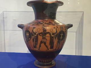
Art Event Reflection
I attended a gallery opening, an exhibition of ancient Greek pottery, on March 23. This was the first art event I attended and I was pleasantly surprised with the knowledge that was presented during the talk. Jenna McKinley, the woman who arranged for the pieces to come to Loyola was clearly passionate about each piece and its history, and I particularly enjoyed that she mentioned what the pieces would have been used for originally as that says a lot about how they are created and how they are, or aren't, preserved. I was shocked by the details, that would have definitely required a lot of time and attention, on every single piece in the exhibit. A piece that would have been used as a cup was much more ornate than a cup we would use today. Because each piece had a practical use, it says a lot about the effort put into every day tasks and objects, and what people who lived in the time of this pottery would have been like. The practicality of a water jug, and the specific and beautiful decorations make for an intriguing combination. My favorite piece in the exhibit was a water jug that was black clay with red in the middle and portrayed a very detailed scene that included both people and animals. In one place at the lip of the jug, it had clearly been broken by being dropped or hit, so while it is an exquisite testament to what potters of the time could do, it was fully utilized as an every day object. Today, such a piece would be put on display and never used for such a task. Jenna's speech also included the more modern history of the pieces and how some of them may have been illegitimately obtained because of their great value. I found it very interesting and even more special that the pieces still hold great value today even after being used and in some cases, broken.

Thursday, March 30, 2017
Postmodernism
Frederic Jameson:
- Van Gogh-A Pair of Boots
- two ways of reading
- 1) "Utopian gesture"
- contrast of colors/symbolic meanings
- reimagines society
- 2) "gap between Earth and World"
- Andy Warhol- Diamond Dust Shoes
- flatness
- no way of reading?
- Disneyland = fantasy
- fantasy world inside is emphasized by singular reality outside
- "the world is no longer real"??
- Postmodern era is characterized by cultural diversity
- people today don't realize the diversity of what they do or say
- postmodernism is a reflection of the variety we experience day to day
- unlike any other style of art
- no era previously experienced diversity like we do today
File
Tuesday, March 28, 2017
The Shape of Time
The first think that struck me when reading Kubler's piece is the idea that today we butcher the timeline of the history of art. By referring to the lives of specific artists, we break art history into blocks by style, instead of understanding they all happen on a single continuum. It is much more interesting to think of different artistic styles this way because we are then made to see the connection between periods and types of art. The way Kubler compared style to a plant was a way I had never thought about how style functions in society before. That all parts are connected by something constant and universal but may vary based on environment is a much more wholesome way of thinking about , again instead of simply looking at styles as blocks that structurally make up art.
When Kubler argued that talent is much less a determinant of how successful an artist will be than luck, I fully agreed with his point. Today, it is a common assumption that it's "hard to make it as an artist" and most people in general become famous through random luck. The time in which an artist lives will have a great impact on how the world sees and reacts to his work regardless of his personal intentions. Someone could be the most talented artist to exist, but if their work isn't popularly liked or even given the chance to be seen, the talent is pointless. I think this is true for anything, and serves as a reminder that being smart doesn't guarantee a job, or being fast won't automatically grant a spot on a sports team.
Overall, I thought that all of Kubler's arguments provide interesting and original ways to reevaluate how we see art and the timeline of artists and styles and how they should be seen fluidly instead of broken into pieces.
Thursday, March 16, 2017
Data Visualization Reflection
The data visualization video was very eye opening in the sense that it analyzed something that almost every person sees daily but pays so little attention to; the infographic. Graphs or diagrams in magazines, on tv, or in advertisements tend to only seem interesting and eye catching because of the instant statistic or fact they present, but the video helps you to realize they are far more important and deserve more though and time than what the eye spends just reading the data. The whole concept that the graphics take lots of data and research that would take hours and hours to comb through and read thoroughly and presents it in a way that provides a message within seconds is astounding. What intrigued me most, however about the video, is the idea that the data is seeking a greater truth and that according to the speakers in the video, they aren't trying to "brainwash" people by using bright colors and arbitrary numbers, but trying to provide a foundation from which an audience can reflect on for themselves and create their own thoughts. I found the very last statement in the video very interesting because it is very much true that people often look for data to confirm what they believe instead of looking for their belief through data. That people who create infographics can find and present a "hero of the piece" that makes the reader want to look further into the story is extremely impressive because it requires the creator to "know their content" and based on data, incite an emotion within a general audience.
Tuesday, February 21, 2017
Advertisement Breakdown
Magazine ad I originally chose to begin my print media collage:


Photoshopped advertisement:

Tuesday, January 31, 2017


The final piece I chose to focus on was this work by Matisse, called The Pierced Rock. Initially I was interested in this piece because it reminded me of the dot work we did in class and the Monet paintings we looked at first in the BMA, in that up close the brush strokes are very separate and noticeable but when you stand back and look at the painting it becomes much more clear. I was interested in a lot of paintings with the same effect but I think this was one of the most dramatic differences from a distance.
Monday, January 23, 2017
Review: Visibility
I have never thought about movies or plays in terms of how the directors, writers, or producers imagined and created them. This is a refreshing perspective because usually I am only concerned with what I see on screen, and while it's generally obvious that a lot of work goes into creating movies, plays etc., even then I think more about filming and editing of footage rather than the original creative process. The idea that there is a visual image at the center of most if not all, written stories seems obvious but again is something I had never actually stopped to consider. I remember writing stories in school a long time ago and being able to vividly imagine the scenes and characters of my story before even finding the right words to put on paper. I think this is something most people don't realize unless they take the time to think about. When the author frames his idea that forms of writing begin with a picture or scene from the writer's imagination, that words originate from pictures, the way he does, it seems almost backwards. Logically, it would seem as though words are supposed to create a mental image for a reader and even for the author, but again so many people must picture their story before they can write it. The greater observation that visual images are the root of works of literature is profound, and will hopefully spark conversations among readers about how this is true in different situations.
Thursday, January 19, 2017
Review: The Whole Ball of Wax
After reading Saltz's The Whole Ball of Wax, it is clear that he has an emotional connection to art that allows a limitless number of reactions while simultaneously understanding its limits in reality. I agree with Saltz's original statement that art can not, in fact, ignite and carry out change entirely on its own. However, I do also agree with arguments within the article that claim that art is much more than a drawing meant for visual pleasure, that art has the capability to incite emotions, start conversations, and be a source of calm and soothing. Saltz's claim that art "creates new thought structures" is particularly appealing to me because every single person who views a piece of artwork may see and interpret it differently, and among all those perspectives, there is bound to be one that is novel to or challenges the norm for the way art is generally perceived. Saltz's final claim that art is essentially a cat, is one that I don't necessarily agree with because in trying to communicate with a cat there will always be uncertainty about what you are trying to understand, what the cat is expressing. However in trying to understand art, the most important thing is what the art expresses to its viewers individually and what effect it has on each person.
Subscribe to:
Posts (Atom)